【Pandago】 A Responsive Vendor Landing Page Built to Convert Merchants
Background
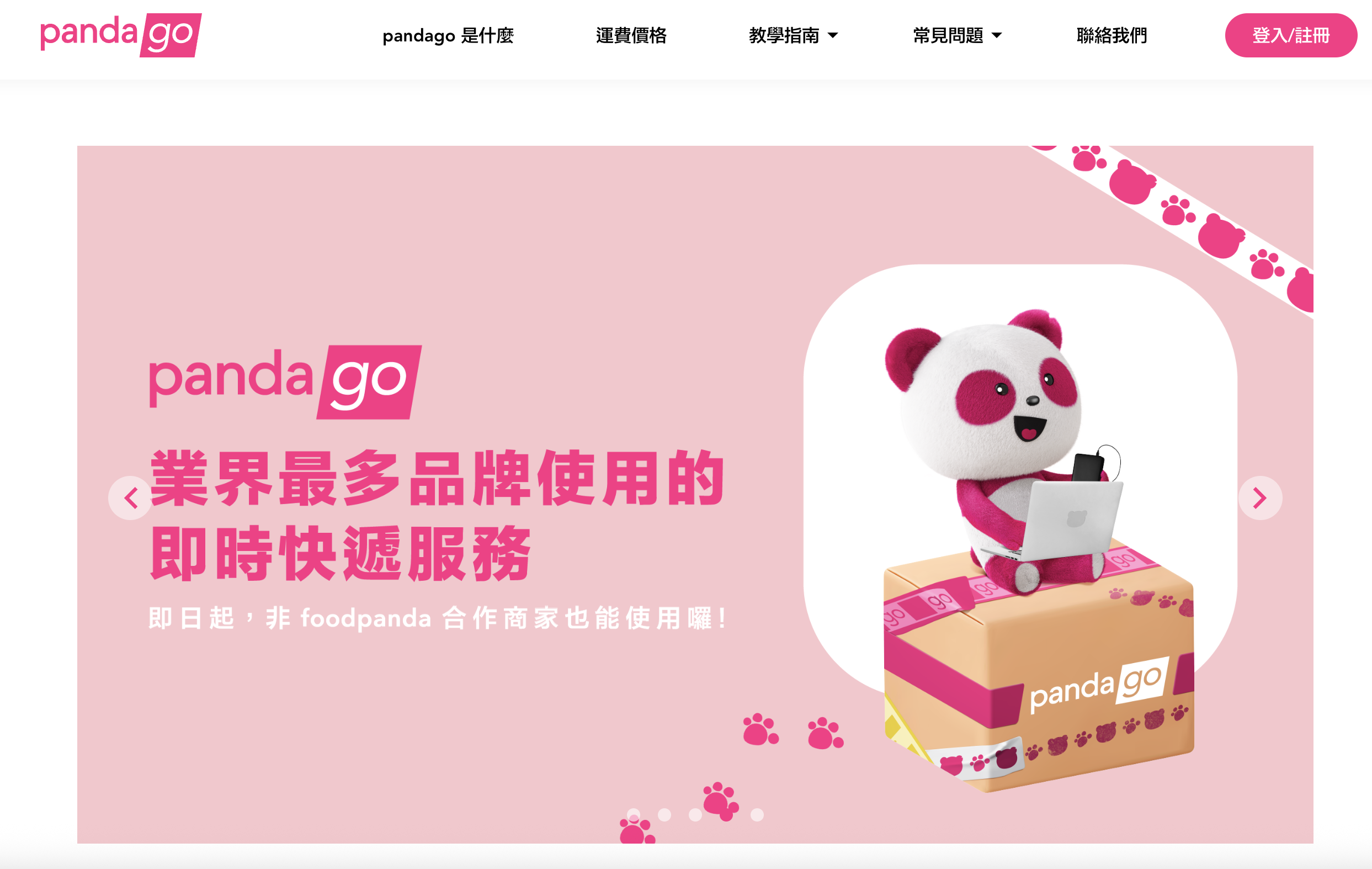
Pandago is foodpanda's standalone, real-time delivery service — it lets any merchant, not just foodpanda-partnered restaurants, request an on-demand courier for local delivery. I worked on the front end of the public vendor landing page, the marketing site merchants land on before they sign up.
What problem did you solve?
The landing page had to do two jobs that pull in opposite directions: cover everything a prospective merchant needs to know (what pandago is, pricing, how to sign up, FAQ, contact) while still getting a visitor to the one answer they actually came for, fast. Most visitors arrive with a single specific question — "how much does it cost" or "how do I sign up" — not intent to read a long page top to bottom. On top of that, a meaningful share of traffic lands on a phone via a shared link, not a desktop browser, so the page couldn't just be a scaled-down version of a desktop design.
Who actually uses it?
Prospective merchants — any local business considering pandago's on-demand courier service, not just existing foodpanda restaurant partners — landing on the public page at vendor.foodpanda.com.tw/pandago before they sign up. This is the first touchpoint in the acquisition funnel, so it's largely cold traffic arriving from search, ads, or a shared link, often on mobile.
What results did it produce?
The page shipped as the live, public vendor-acquisition page for pandago — the page every prospective Taiwan merchant sees before signing up. It runs as a single long-scrolling page with anchor navigation, a hero carousel, an infinite logo marquee for social proof, and full responsive behavior across desktop, tablet, and mobile.
What key decisions did you own?
- Anchor navigation over routing. The top nav (
pandago 是什麼,運費價格,教學指南,常見問題,聯絡我們) smooth-scrolls to sections on the same page instead of routing to separate pages — matching navigation to the page's single-scroll structure so visitors can jump straight to the one section they need. - A carousel instead of a static hero banner. The hero section is the highest-attention real estate on the page, so I built it as a carousel that rotates through multiple promotional slides with manual arrow controls, rather than committing that space to one static message.
- A logo marquee instead of a static logo grid. Partner logos (McDonald's, Carrefour, KFC, and other enterprise clients) scroll continuously rather than sitting in a fixed block — a compact way to establish social proof and scale ("業界最多品牌使用的") without pushing the rest of the page further down.
- Mobile-first responsive behavior for every interactive piece, not just the static layout — the nav collapses into a mobile menu, sections restack vertically, and the carousel/marquee both adapt, since I treated mobile as a primary case rather than a fallback.
What constraints did you face, and how did you trade off?
The single-scroll structure meant I couldn't lean on traditional multi-page routing to organize content — everything (pricing, tutorial, FAQ, contact) had to fit into scrollable sections reachable by anchor link, which constrains how much can live on the page before it feels bloated. The hero section also forced a trade-off between simplicity and message coverage: a static banner is simpler to build and reason about, but a carousel was worth the added interaction complexity because it let the highest-attention spot on the page carry more than one message. Given that a large share of visitors arrive on mobile via a shared link rather than desktop, I prioritized mobile-first responsive behavior for every interactive component over polishing desktop-only interactions.